- 首页
- International
- 艾特奖
- 文化节
- 服务体系
-
网站导航
项目名称:modern outfitters 服装体验展厅
项目时间:2018年5月
项目面积:880平米
主案设计:尹晨光
软装设计:偌僖
摄影:张浩
撰文:Dawn
在我看来设计是解决人与物、与空间之间的方案。就这套作品中的空间形体来说更代表着一种探索和向往。也是可以根据产品的气质自然而然生长的。空间非从设计而出,而经过设计之手法,将真实空间还原。空间的留白是对空间的本质的体现,也是为我们的主体服装提供暂居空间,让服装能在此空间展现其特有的气质。
这套作品里有极简、有细节;有亲近,有梳离;有童趣、有时尚。有服装展示区(女装、男装、童装)、有网红自拍区、有超舒适的试衣区、有咖啡书吧、有儿童游玩区,真的可以说每一个身处其中的人,都能在不同的生活状态或情绪里,都能在不同的空间功能区,找到和这个空间属性相契合的点。
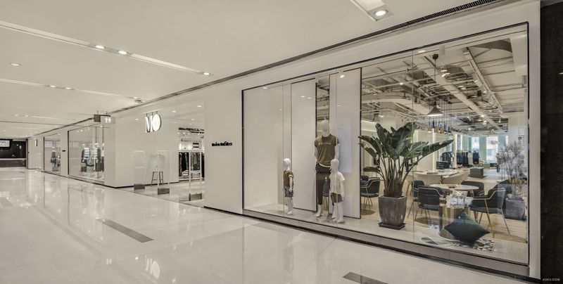
空间中之空间,外展示橱窗区,我借用屏风这个载体,满足橱窗对不同主题、不同造型的功能需求。与东方一步一景的意境有异曲同工之效。
左边区域我们通过设计手法把女装产品放在前区,把收银区放在了二进区,试衣间则放在了后期相对稳定的三进区域。
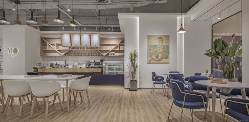
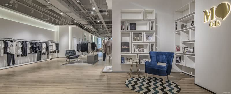
右边一进,我们在入口处设咖啡书吧,一是在整个空间起一个重要节奏趣味,二是体现我们的书香、咖啡文化,你可以停下来读一本书、喝杯咖啡。右边二进是我们的男装区,儿童区放在了我们相对安全的三进区。
就整体设计而言,相对比较适中。
Design specification
Project name: MO clothing experience exhibition hall
Project time: in May 2018
The project area: 880 square meters
The main case design: the morning yoon
Soft outfit design: provided Xi
Photography: zhang hao
wrote:
It seems to me that design is a solution for the people and things, and the space between. In terms of the spatial form of the work more represents a kind of exploration and yearning. Can also according to the product of the temperament of natural growth. Space is not from the design, and designed the technique, the real space reduction. Dimensional space is a reflection of the nature of space, is the body of the garment for us to provide in the space, make clothing can show its unique temperament in this space.
The minimalist, detail is in the works; A close, a comb from; Tong qu, fashion. Have clothing exhibit (women's, men's clothing, children's clothing), web celebrity self-time, super comfortable the fitting area, coffee books, children's play area, really can say every body part, can be in different status, or mood of life, can be in different function space, find and the space attribute corresponds to the point.
Outside space within a space, showcase area, I borrow this carrier screen, meet with different themes, different formative window function demand. Step one scene of the artistic conception with the east has a similar effect.
Area on the left we through the area before the women's clothing products in the design gimmick, the cashier area in binary area, the fitting room is on the late SanJin area is relatively stable.
Entered on the right, we set at the entrance of coffee books, one is an important rhythm interest in whole space, 2 it is to reflect our elegant, coffee culture, you can stop and read a book, a cup of coffee. On the right side of the binary is our men's area, children's area on our SanJin relatively safe area.
In terms of the overall design, relatively moderate, is very humble, know their own role, without a presumptuous guest usurps the host's role.

外展示面

咖啡书吧区

男装区